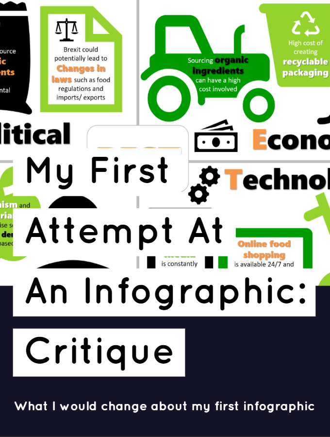
One of my very first assignments for my degree in digital marketing was to create an infographic after having conducted a marketing audit and assessed their current marketing mix. The company I chose was Bol, a food company which sells a variety of vegetarian and vegan products.
For this infographic I received 91% and a first class honours for the assignment and you can see the complete infographic below.

While I am really happy with the result and at the time, super satisfied with how it turned out, I would make a lot of changes now I look back on it a year and a half later.
What Went Well
Colours & Icons
One thing I do enjoy about my infographic is the colour scheme and the fact that the icons are all of the same style. I feel all of the sections go together fairly nicely and look like they have the same design scheme running throughout.
Branding
The second thing I think went well is the fact that the infographic looks on brand. Bol is all about being green, minimising their impact on the environment and rave about being plant based. If the colour scheme for this infographic doesn’t scream ‘We are eco-friendly!’ then I don’t know what does.
What I Would Change
Text To Icon Ratio
At the moment, I think it is pretty clear to see that the infographic is just too busy. There are far too many icons and the text was used too sparingly. I think the whole infographic could do with more text and fewer icons. I think the icons actually take away from some points rather than add anything. An infographic is all about putting across information in a visual and understandable way. However, at I moment, I don’t think it really achieves this. You have to really look and read to know what is going on.
Flow
Similar to the last point, there is too much going on to understand exactly what is going on at first glance. The sections aren’t very distinct and lack clear separation. However, that also contradicts my feelings that you can clearly see that I made each section separately and pasted them together, (and if you couldn’t tell, I bet you can’t unsee it.) It was the assignment brief however to create one singular infographic when I feel they would be better suited to more detailed, shorter, individual infographics.
To improve these issues I would make a real effort to change the flow of the infographic. I would probably have a coloured background and pale boxes on top separating each section. I would then maybe include graphics/icons that went across the borders of each sections so it looks less pasted together. Although I probably didn’t explain that very well!
What are your thoughts on my infographic? I would love to know your feedback, especially if you are into design. Let me know in the comments below and I hope you have a great day.


